Fed dot plot explained: What it is and why investors watch it
CNBC-TV18 1 hr ago·16 Sept 2026, 12:17 pm
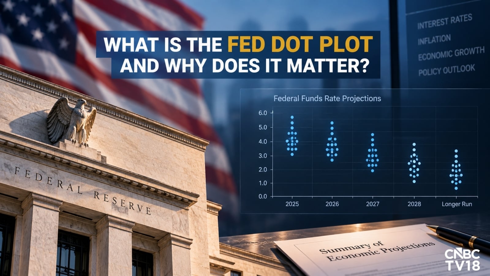
The Federal Reserve's 'dot plot' is a visual chart showing where each Fed official expects interest rates to go. It is not a promise but a snapshot of their individual forecasts for the federal funds rate over the next few years. Because these officials include the Fed Chair and other top policymakers, the chart is a key barometer for the central bank's future policy stance.
For investors, the dot plot matters because it reveals the Fed's confidence in the economy. If officials signal they expect to keep rates higher for longer, it can signal a tough economic environment. Conversely, a shift toward lower rates can boost sentiment. Investors watch this closely to gauge the outlook for equity markets, bond yields, and the overall economic cycle.
What to watch next is how the dots move over time. A shift in the median rate or the number of officials expecting cuts versus hikes can signal a change in the Fed's strategy. Market participants will also look for commentary from Fed officials to see if the dot plot reflects a consensus or if there is disagreement among the committee members.
Excerpt from CNBC-TV18
The Fed dot plot offers a snapshot of where Federal Open Market Committee (FOMC) participants individually expect the federal funds rate to be over the coming years. It is closely watched by financial markets because it can show how policymakers’ expectations for interest rates are changing. What is the Fed dot plot?…Read the original at CNBC-TV18
Key takeaways
- Category: Economy.
- Flagged as a high-impact, market-moving story.
Why it matters
This is a high-impact development and could move the stock. Use the price and stock snapshot to gauge how the market is responding.